
There are a few common questions that we get when speaking with Code Climate Quality customers. They range from “What’s the Code Climate score for the Code Climate repo?” to “What’s the average GPA of a Rails application?” When I think back on the dozens of conversations I’ve had about Code Climate, one thing is clear – people are interested in our data!
Toward that end, this is the first post in a series intended to explore Code Climate’s data set in ways that can deepen our understanding of software engineering, and hopefully quench some people’s curiosities as well. We have lots of questions to ask of our data set, and we know that our users have lots of their own, but we wanted to start with one that’s fundamental to Code Climate’s mission, and that we’re asked a lot:
Does Team Size Impact Code Quality?
Is it true that more developers means more complexity? Is there an ideal number of developers for a team? What can we learn from this? Let’s find out!
The Methodology
There are a variety of different ways that this question can be interpreted, even through the lens of our data set. Since this is the first post in a series, and we’re easing into this whole “data science” thing, I decided to start with something pretty straightforward – plotting author count against Code Climate’s calculated GPA for a repo.
Author count is calculated by summing the authors present in commits over a given period, in this case 30 days. The GPA is calculated by looking up the most recent quality report for a repo and using the GPA found there. Querying this data amounted to a few simple lines of Ruby code to extract from our database, including exporting the data as a CSV for processing elsewhere.
I decided to limit the query to our private repositories because the business impact of the answer to the question at hand seems potentially significant. By analyzing private repositories we will be able to see many more Rails applications than are available in Open Source, and additionally, the questions around Open Source repos are manifold and deserve to be treated separately.
Please note that the data I’m presenting is completely anonymized and amounts to aggregate data from which no private information can be extrapolated.
Once I had the information in an easily digestible CSV format, I began to plot the data in a program called Wizard, which makes statistical exploration dead simple. I was able to confirm that there was a negative correlation between the size of a team and the Code Climate GPA, but the graph it produces isn’t customizable enough to display here. From there I went to R, where a few R wizard friends of mine helped me tune a few lines of code that transform the CSV a graph.
The fit line above indicates that there is indeed an indirect relationship between code quality and team size. While not a very steep curve, the line shows that a decline of over 1 GPA point is possible when team sizes grow beyond a certain point; let’s dig a little deeper into this data.
The graph is based on data from 10,000 observations, where each is a distinct repo and the GPA measurement and author count measurements are the latest available. The statistical distributions of the two columns show that the data needed some filtering. For example, the GPA summary seems quite reasonable:
> summary(observations$GPA) Min. 1st Qu. Median Mean 3rd Qu. Max. 0.000 2.320 3.170 2.898 3.800 4.000
As you would expect, a pretty healthy distribution of GPAs. The author count, on the other hand, is pretty out of whack:
> summary(observations$AuthorCount) Min. 1st Qu. Median Mean 3rd Qu. Max. 1.000 1.000 2.000 3.856 4.000 130.000
The 3rd Quantile ranges 4-130! That’s way too big of a spread, so I’ve corrected for that a bit by filtering the max to 50 in the graph above. This gives enough of a trend to show how new teams may tend to fall according to the model, but doesn’t completely blow it out with outliers. After working on this graph with the full data set and showing it to a couple people, some themes emerged:
- The data should be binned, with 10+ authors being the largest team size
- Lines or bars could be used to show the “density” of GPAs for a specific binned team size
Some CSV and SQL magic made it pretty straightforward to bin the data, which can then be plotted in R using a geometric density function applied to team sizes per GPA score. This lets us see areas of concentration of GPA scores per team size bin.
Now that the team sizes are broken up into smaller segments, we can see some patterns emerge. It appears easier to achieve a 4.0 GPA if you are a solo developerand additionally, the density of teams greater than 10 concentrates under the 3.0 GPA mark. This is a much richer way to look at the data than the scatterplot above and I learned a lot comparing the two approaches.
Nice first impressions, but now that we’ve seen the graphs, what can we learn?
Conclusions
How to interpret the results of this query is quite tricky. On one hand, there does appear to be a correlation supporting the notion that smaller teams can produce more organized code. On the other hand, the strength of this correlation is not extreme, and it is worth noting that teams of up to 10, 20, and 30 members are capable of maintaining very respectable GPAs which are greater than 3.0 (recall from the summary above that the mean GPA is 2.898 and that only the top 25% score greater than 3.8).
The scatterplot graph shows a weak fit line which suggests a negative correlation, while the density line graph (which could also be rendered with bars) shows that teams of up to 10 members have an easier time maintaining a 3.0+ GPA than teams with more than 10 members. Very intriguing.
It is worth considering what other factors could be brought into play when it comes to this model. Some obvious contenders include the size of the code base, the age of the code base, and the number of commits in a given period. It’s also worth looking into how this data would change if all of the historical data was pulled up, to sum the total number of authors over the life of a project.
One conclusion to draw might be that recent arguments for breaking down large teams into smaller, service oriented teams may have some statistical backing. If we wanted to be as scientific about it as possible, we can look at how productive teams tend to be in certain size ranges and produce an ideal team size as a function of productivity and 75% percentile quality scores. Teams can be optimized to produce a certain amount of code of a certain quality for a certain price – but now we’re sounding a little creepy.
My take is that this data supports what most developers already know – that large teams with large projects are hard to keep clean; that’s why we work as hard as we do. If you’re nearing that 10-person limit, know that you’ll have to work extra hard to beat the odds and have a higher than 3.0 GPA.
On a parting note, we are sure that there are more sophisticated statistical analyses that could be brought to bear on this data, which is why we have decided to publish the data set and the code for this blog post here. Check it out and let us know if you do anything cool with it!
Special thanks to Allen Goodman (@goodmanio), JD Maturen (@jdmaturen), and Leif Walsh (@leifw) for their code and help and to Julia Evans (@b0rk) for the inspiration.

Related Articles
Navigating the world of software engineering or developer productivity insights can feel like trying to solve a complex puzzle, especially for large-scale organizations. It's one of those areas where having a cohesive strategy can make all the difference between success and frustration. Over the years, as I’ve worked with enterprise-level organizations, I’ve seen countless instances where a lack of strategy caused initiatives to fail or fizzle out.
In my latest webinar, I breakdown the key components engineering leaders need to consider when building an insights strategy.
Why a Strategy Matters
At the heart of every successful software engineering team is a drive for three things:
- A culture of continuous improvement
- The ability to move from idea to impact quickly, frequently, and with confidence
- A software organization delivering meaningful value
These goals sound simple enough, but in reality, achieving them requires more than just wishing for better performance. It takes data, action, and, most importantly, a cultural shift. And here's the catch: those three things don't come together by accident.
In my experience, whenever a large-scale change fails, there's one common denominator: a lack of a cohesive strategy. Every time I’ve witnessed a failed attempt at implementing new technology or making a big shift, the missing piece was always that strategic foundation. Without a clear, aligned strategy, you're not just wasting resources—you’re creating frustration across the entire organization.
Sign up for a free, expert-led insights strategy workshop for your enterprise org.
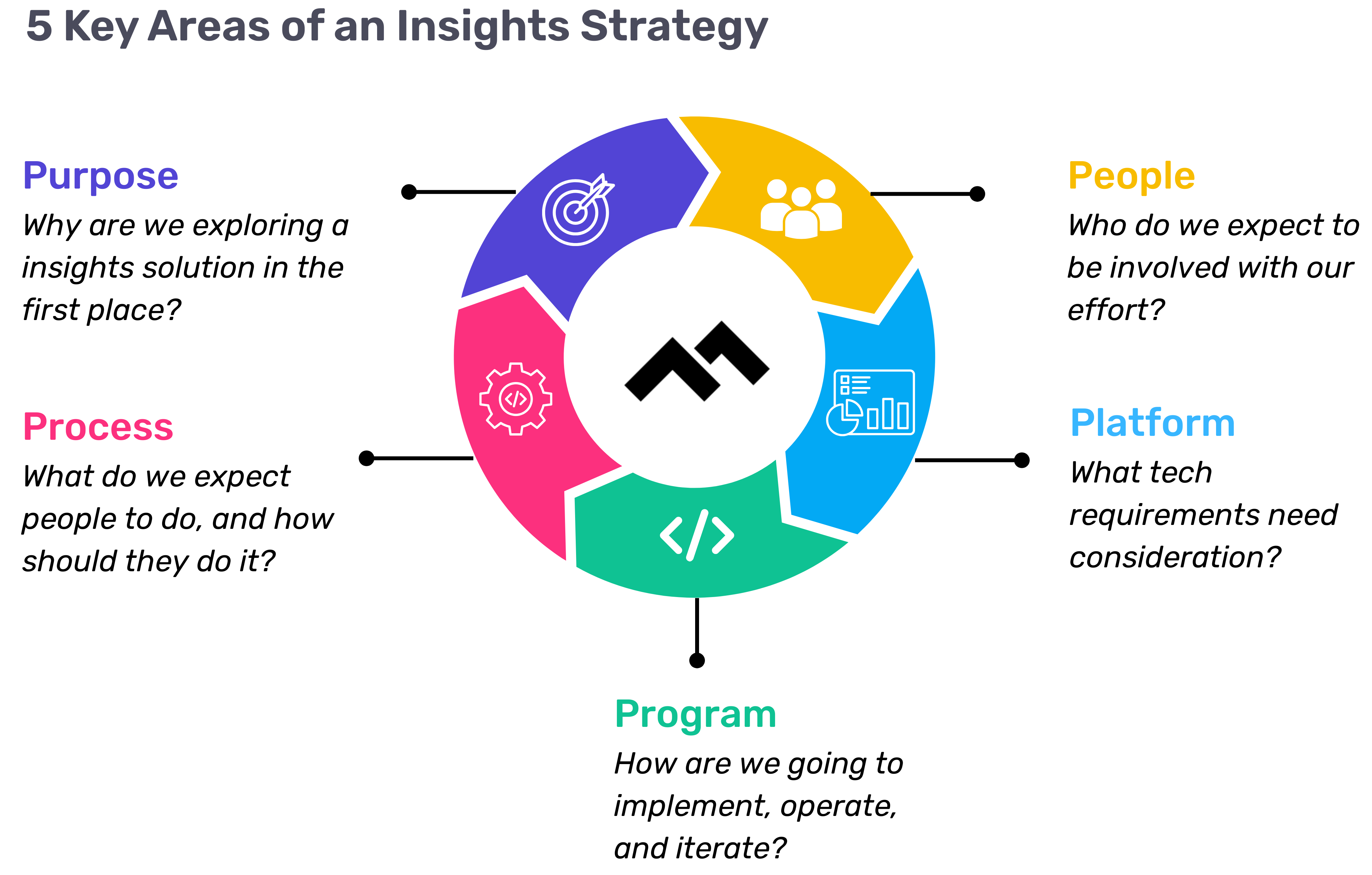
Step 1: Define Your Purpose
The first step in any successful engineering insights strategy is defining why you're doing this in the first place. If you're rolling out developer productivity metrics or an insights platform, you need to make sure there’s alignment on the purpose across the board.
Too often, organizations dive into this journey without answering the crucial question: Why do we need this data? If you ask five different leaders in your organization, are you going to get five answers, or will they all point to the same objective? If you can’t answer this clearly, you risk chasing a vague, unhelpful path.
One way I recommend approaching this is through the "Five Whys" technique. Ask why you're doing this, and then keep asking "why" until you get to the core of the problem. For example, if your initial answer is, “We need engineering metrics,” ask why. The next answer might be, “Because we're missing deliverables.” Keep going until you identify the true purpose behind the initiative. Understanding that purpose helps avoid unnecessary distractions and lets you focus on solving the real issue.
Step 2: Understand Your People
Once the purpose is clear, the next step is to think about who will be involved in this journey. You have to consider the following:
- Who will be using the developer productivity tool/insights platform?
- Are these hands-on developers or executives looking for high-level insights?
- Who else in the organization might need access to the data, like finance or operations teams?
It’s also crucial to account for organizational changes. Reorgs are common in the enterprise world, and as your organization evolves, so too must your insights platform. If the people responsible for the platform’s maintenance change, who will ensure the data remains relevant to the new structure? Too often, teams stop using insights platforms because the data no longer reflects the current state of the organization. You need to have the right people in place to ensure continuous alignment and relevance.
Step 3: Define Your Process
The next key component is process—a step that many organizations overlook. It's easy to say, "We have the data now," but then what happens? What do you expect people to do with the data once it’s available? And how do you track if those actions are leading to improvement?
A common mistake I see is organizations focusing on metrics without a clear action plan. Instead of just looking at a metric like PR cycle times, the goal should be to first identify the problem you're trying to solve. If the problem is poor code quality, then improving the review cycle times might help, but only because it’s part of a larger process of improving quality, not just for the sake of improving the metric.
It’s also essential to approach this with an experimentation mindset. For example, start by identifying an area for improvement, make a hypothesis about how to improve it, then test it and use engineering insights data to see if your hypothesis is correct. Starting with a metric and trying to manipulate it is a quick way to lose sight of your larger purpose.
Step 4: Program and Rollout Strategy
The next piece of the puzzle is your program and rollout strategy. It’s easy to roll out an engineering insights platform and expect people to just log in and start using it, but that’s not enough. You need to think about how you'll introduce this new tool to the various stakeholders across different teams and business units.
The key here is to design a value loop within a smaller team or department first. Get a team to go through the full cycle of seeing the insights, taking action, and then quantifying the impact of that action. Once you've done this on a smaller scale, you can share success stories and roll it out more broadly across the organization. It’s not about whether people are logging into the platform—it’s about whether they’re driving meaningful change based on the insights.
Step 5: Choose Your Platform Wisely
And finally, we come to the platform itself. It’s the shiny object that many organizations focus on first, but as I’ve said before, it’s the last piece of the puzzle, not the first. Engineering insights platforms like Code Climate are powerful tools, but they can’t solve the problem of a poorly defined strategy.
I’ve seen organizations spend months evaluating these platforms, only to realize they didn't even know what they needed. One company in the telecom industry realized that no available platform suited their needs, so they chose to build their own. The key takeaway here is that your platform should align with your strategy—not the other way around. You should understand your purpose, people, and process before you even begin evaluating platforms.
Looking Ahead
To build a successful engineering insights strategy, you need to go beyond just installing a tool. An insights platform can only work if it’s supported by a clear purpose, the right people, a well-defined process, and a program that rolls it out effectively. The combination of these elements will ensure that your insights platform isn’t just a dashboard—it becomes a powerful driver of change and improvement in your organization.
Remember, a successful software engineering insights strategy isn’t just about the tool. It’s about building a culture of data-driven decision-making, fostering continuous improvement, and aligning all your teams toward achieving business outcomes. When you get that right, the value of engineering insights becomes clear.
Want to build a tailored engineering insights strategy for your enterprise organization? Get expert recommendations at our free insights strategy workshop. Register here.Register here.
Andrew Gassen has guided Fortune 500 companies and large government agencies through complex digital transformations. He specializes in embedding data-driven, experiment-led approaches within enterprise environments, helping organizations build a culture of continuous improvement and thrive in a rapidly evolving world.
Most organizations are great at communicating product releases—but rarely do the same for process improvements that enable those releases. This is a missed opportunity for any leader wanting to expand “growth mindset,” as curiosity and innovation is as critical for process improvement as it is product development.
Curiosity and innovation aren’t limited to product development. They’re just as essential in how your teams deliver that product. When engineering and delivery leaders share what they’re doing to find efficiencies and unclog bottlenecks, they not only improve Time to Value — they help their peers level up too.
Create Buzz Around Process Wins
Below is a template leaders can use via email or communication app (Slack, Microsoft Teams) to share process changes with their team. I’ve personally seen updates like this generate the same level of energy as product announcements—complete with clap emojis👏 and follow-up pings like “Tell me more!” Even better, they’re useful for performance reviews and make great resume material for the leads who author them (excluding any sensitive or proprietary content, of course).
Subject: [Experiment update]
[Date]
Experiment Lead: [Name]
Goal: [Enter the longer term goal your experiment was in service of]
Opportunity: [Describe a bottleneck or opportunity you identified for some focused improvement]
Problem: [Describe the specific problem you aimed to solve]
Solution: [Describe the very specific solution you tested]
Metric(s): [What was the one metric you determined would help you know if your solution solved the problem? Were there any additional metrics you kept track of, to understand how they changed as well?]
Action: [Describe, in brief, what you did to get the result]
Result: [What was the result of the experiment, in terms of the above metrics?]
Next Step: [What will you do now? Will you run another experiment like this, design a new one, or will you rollout the solution more broadly?]
Key Learnings: [What did you learn during this experiment that is going to make your next action stronger?]
Please reach out to [experiment lead’s name] for more detail.
Sample Use Case
Subject: PR Descriptions Boost Review Speed by 30%
March 31, 2025
Experiment Lead: Mary O’Clary
Goal: We must pull a major capability from Q4 2024 into Q2 2025 to increase our revenue. We believe we can do this by improving productivity by 30%.
Opportunity: We found lack of clear descriptions were a primary cause of churn & delay during the review cycle. How might we improve PR descriptions, with information reviewers need?
Problem: Help PR Reviewers more regularly understand the scope of PRs, so they don’t need to ask developers a bunch of questions.
Solution: Issue simple guidelines for what we are looking for PR descriptions
Metric(s): PR Review Speed. We also monitored overall PR Cycle Time, assuming it would also improve for PRs closed within our experiment timeframe.
Action: We ran this experiment over one 2 week sprint, with no substantial changes in complexity of work or composition of the team. We kept the timeframe tight to help eliminate additional variables.
Result: We saw PR Review Speed increase by 30%
Next Step: Because of such a great result and low perceived risk, we will roll this out across Engineering and continue to monitor both PR Review Speed & PR Cycle Time.
Key Learnings: Clear, consistent PR descriptions reduce reviewer friction without adding developer overhead, giving us confidence to expand this practice org-wide to help accelerate key Q2 2025 delivery.
Please reach out to Mary for more detail.
How Make This Process Stick
My recommendation is to appoint one “editor in chief” to issue these updates each week. They should CC the experiment lead on the communication to provide visibility. In the first 4-6 weeks, this editor may need to actively solicit reports and coach people on what to share. This is normal—you’re building a new behavior. During that time, it's critical that managers respond to these updates with kudos and support, and they may need to be prompted to do so in the first couple of weeks.
If these updates become a regular ritual, within ~3 months, you’ll likely have more contributions than you can keep up with. That’s when the real cultural shift happens: people start sharing without prompting, and process improvement becomes part of how your org operates.
I’ve seen this work in large-scale organizations, from manufacturing to healthcare. Whether your continuous improvement culture is just getting started or already mature, this small practice can help you sustain momentum and deepen your culture of learning.
Give it a shot, and don’t forget to celebrate the wins along the way.
Jen Handler is the Head of Professional Services at Code Climate. She’s an experienced technology leader with 20 years of building teams that deliver outcome-driven products for Fortune 50 companies across industries including healthcare, hospitality, retail, and finance. Her specialties include goal development, lean experimentation, and behavior change.
Output is not the same as impact. Flow is not the same as effectiveness. Most of us would agree with these statements—so why does the software industry default to output and flow metrics when measuring success? It’s a complex issue with multiple factors, but the elephant in the room is this: mapping engineering insights to meaningful business impact is far more challenging than measuring developer output or workflow efficiency.
Ideally, data should inform decisions. The problem arises when the wrong data is used to diagnose a problem that isn’t the real issue. Using misaligned metrics leads to misguided decisions, and unfortunately, we see this happen across engineering organizations of all sizes. While many companies have adopted Software Engineering Intelligence (SEI) platforms—whether through homegrown solutions or by partnering with company that specializes in SEI like Code Climate—a clear divide has emerged. Successful and mature organizations leverage engineering insights to drive real improvements, while others collect data without extracting real value—or worse, make decisions aimed solely at improving a metric rather than solving a real business challenge.
From our experience partnering with large enterprises with complex structures and over 1,000 engineers, we’ve identified three key factors that set high-performing engineering organizations apart.
1. Treating Software Engineering Insights as a Product
When platform engineering first emerged, early innovators adopted the mantra of “platform as a product” to emphasize the key principles that drive successful platform teams. The same mindset applies to Software Engineering Intelligence (SEI). Enterprise organizations succeed when they treat engineering insights as a product rather than just a reporting tool.
Data shouldn’t be collected for the sake of having it—it should serve a clear purpose: helping specific users achieve specific outcomes. Whether for engineering leadership, product teams, or executive stakeholders, high-performing organizations ensure that engineering insights are:
- Relevant – Focused on what each audience actually needs to know.
- Actionable – Providing clear next steps, not just numbers.
- Timely – Delivered at the right moment to drive decisions.
Rather than relying on pre-built dashboards with generic engineering metrics, mature organizations customize reporting to align with team priorities and business objectives.
For example, one of our healthcare customers is evaluating how AI coding tools like GitHub Copilot and Cursor might impact their hiring plans for the year. They have specific questions to answer and are running highly tailored experiments, making a custom dashboard essential for generating meaningful, relevant insights. With many SEI solutions, they would have to externalize data into another system or piece together information from multiple pages, increasing overhead and slowing down decision-making.
High-performing enterprise organizations don’t treat their SEI solution as static. Team structures evolve, business priorities shift, and engineering workflows change. Instead of relying on one-size-fits-all reporting, they continuously refine their insights to keep them aligned with business and engineering goals. Frequent iteration isn’t a flaw—it’s a necessary feature, and the best organizations design their SEI operations with this in mind.
2. The Value of Code is Not the Code
Many software engineering organizations focus primarily on code-related metrics, but writing code is just one small piece of the larger business value stream—and rarely the area with the greatest opportunities for improvement. Optimizing code creation can create a false sense of progress at best and, at worst, introduce unintended bottlenecks that negatively impact the broader system.
High-performing engineering organizations recognize this risk and instead measure the effectiveness of the entire system when evaluating the impact of changes and decisions. Instead of focusing solely on PR cycle time or commit activity, top-performing teams assess the entire journey:
- Idea generation – How long does it take to move from concept to development?
- Development process – Are teams working efficiently? Are bottlenecks slowing down releases?
- Deployment & adoption – Once shipped, how quickly is the feature adopted by users?
- Business outcomes – Did the feature drive revenue, retention, or efficiency improvements?
For example, reducing code review time by a few hours may seem like an efficiency win, but if completed code sits for six weeks before deployment, that improvement has little real impact. While this may sound intuitive, in practice, it’s far more complicated—especially in matrixed or hierarchical organizations, where different teams own different parts of the system. In these environments, it’s often difficult, though not impossible, for one group to influence or improve a process owned by another.
One of our customers, a major media brand, had excellent coding metrics yet still struggled to meet sprint goals. While they were delivering work at the expected rate and prioritizing the right items, the perception of “failed sprints” persisted, creating tension for engineering leadership. After further analysis, we uncovered a critical misalignment: work was being added to team backlogs after sprints had already started, without removing any of the previously committed tasks. This shift in scope wasn’t due to engineering inefficiency—it stemmed from the business analysts' prioritization sessions occurring after sprint commitments were made. A simple rescheduling of prioritization ceremonies—ensuring that business decisions were finalized before engineering teams committed to sprint goals. This small yet system-wide adjustment significantly improved delivery consistency and alignment—something that wouldn’t have been possible without examining the entire end-to-end process.
3. Shifting from Tactical Metrics to Strategy
There are many frameworks, methodologies, and metrics often referenced as critical to the engineering insights conversation. While these can be useful, they are not inherently valuable on their own. Why? Because it all comes down to strategy. Focusing on managing a specific engineering metric or framework (i.e. DORA or SPACE) is missing the forest for the trees. Our most successful customers have a clear, defined, and well-communicated strategy for their software engineering insights program—one that doesn’t focus on metrics by name. Why? Because unless a metric is mapped to something meaningful to the business, it lacks the context to be impactful.
Strategic engineering leaders at large organizations focus on business-driven questions, such as:
- Is this engineering investment improving customer experience?
- Are we accelerating revenue growth?
- Is this new approach or tool improving cross-functional collaboration?
Tracking software engineering metrics like cycle time, PR size, or deployment frequency can be useful indicators, but they are output metrics—not impact metrics. Mature organizations go beyond reporting engineering speed and instead ask: "Did this speed up product releases in a way that drove revenue?"
While challenging to measure, this is where true business value lies. A 10% improvement in cycle time may indicate progress, but if sales remain flat, did it actually move the needle? Instead of optimizing isolated metrics, engineering leaders should align their focus with overarching business strategy. If an engineering metric doesn’t directly map to a key strategic imperative, it’s worth reevaluating whether it’s the right thing to measure.
One of our retail customers accelerated the release of a new digital capability, allowing them to capture additional revenue a full quarter earlier than anticipated. Not only did this directly increase revenue, but the extended timeline of revenue generation created a long-term financial impact—a result that finance teams, investors, and the board highly valued. The team was able to trace their decisions back to insights derived from their engineering data, proving the direct connection between software delivery and business success.
Understanding the broader business strategy isn’t optional for high-performing engineering organizations—it’s a fundamental requirement. Through our developer experience surveys, we’ve observed a significant difference between the highest-performing organizations and the rest as it relates to how well developers understand the business impact they are responsible for delivering. Organizations that treat engineers as task-takers, isolated from business impact, consistently underperform—even if their coding efficiency is exceptional. The engineering leaders at top-performing organizations prioritize alignment with strategy and avoid the distraction of tactical metrics that fail to connect to meaningful business outcomes.
Learn how to shift from micro engineering adjustments to strategic business impact. Request a Code Climate Diagnostic.
Code Climate has supported thousands of engineering teams of all sizes over the past decade, enhancing team health, advancing DevOps practices, and providing visibility into engineering processes. According to Gartner®, the Software Engineering Intelligence (SEI) platform market is expanding as engineering leaders increasingly leverage these platforms to enhance productivity and drive business value. As pioneers in the SEI space, the Code Climate team has identified three key takeaways from partnerships with our Fortune 100 customers:
- Engineering Metrics Are Not Enough
- Engineering leaders that adopt a Software Engineering Intelligence (SEI) platform without a proper SEI strategy fail to extract value from the data
- Engineering leaders that adopt quantitative metrics without qualitative measures are missing the full picture
- Engineering leaders that adopt a Software Engineering Intelligence (SEI) platform without a proper SEI strategy fail to extract value from the data
- Hands-Off Approach Falls Short
- Approaching an SEI platform as a traditional turnkey SaaS product does not ensure team success
- Organizations that lack collaboration with an SEI solutions provider often struggle to drive adoption and understanding of engineering insights
- Approaching an SEI platform as a traditional turnkey SaaS product does not ensure team success
- Insights Alone Do Not Drive Outcomes
- Engineering leaders often struggle to translate insights from an SEI platform into actionable steps
- Engineering leaders often struggle to align engineering performance to meaningful business outcomes
- Engineering leaders often struggle to translate insights from an SEI platform into actionable steps
Empowering Engineering Leaders at Enterprise Organizations
The above takeaways have prompted a strategic shift in Code Climate’s roadmap, now centered on enterprise organizations with complex engineering team structure and workflows. As part of this transition, our flagship Software Engineering Intelligence (SEI) platform, Velocity, is now replaced by an enhanced SEI platform, custom-designed for each leader and their organization. With enterprise-level scalability, Code Climate provides senior engineering leaders complete autonomy over their SEI platform, seamlessly integrating into their workflows while delivering the customization, flexibility, and reliability needed to tackle business challenges.
Moreover, we understand that quantitative metrics from a data platform alone cannot transform an organization, which is why Code Climate is now a Software Engineering Intelligence Solutions Partner—offering five key characteristics that define our approach
- Tailored Solutions: We provide engineering solutions via quantitative insights and qualitative workshops that are specifically designed to meet the unique needs of enterprise engineering teams—moving beyond standard, black-box solutions.
- Strategic Collaboration: We enable our enterprise customers to build an SEI strategy, engaging with key stakeholders to align Code Climate’s solution and services with their broader business goals.
- Long-Term Partnership: Our strategic partnership with our enterprise customers is typically ongoing, focusing on long-term value rather than offering a standard insights platform. As an enterprise-level SEI solutions partner, we are invested in the sustained success of our customers.
- Expert Guidance: We offer expert guidance and actionable recommendations to help our enterprise customers navigate challenges, optimize performance, and achieve business goals.
- End-to-End Support: We provide comprehensive services, from advisory support and implementation to ongoing support and optimization.
A Message from the New CEO of Code Climate
"During my time at Pivotal Software, Inc., I met with hundreds of engineering executives who consistently asked, “How do I improve my software engineering organization?” These conversations revealed a universal challenge: aligning engineering efforts with business goals. I joined Code Climate because I'm passionate about helping enterprise organizations address these critical questions with actionable insights and data-driven strategies that empower engineering executives to drive meaningful change." - Josh Knowles, CEO of Code Climate
Ready to make data-driven engineering decisions to maximize business impact? Request a consultation.Request a consultation.
Today, we’re excited to share that Code Climate Quality has been spun out into a new company: Qlty Software. Code Climate is now focused entirely on its next phase of Velocity, our Software Engineering Intelligence (SEI) solution for enterprise organizations
How It Started
I founded Code Climate in 2011 to help engineering teams level up with data. Our initial Quality product was a pioneer for automated code review, helping developers merge with confidence by bringing maintainability and code coverage metrics into the developer workflow.
Our second product, Velocity, was launched in 2018 as the first Software Engineering Intelligence (SEI) platform to deliver insights about the people and processes in the end-to-end software development lifecycle.
All the while, we’ve been changing the way modern software gets built. Quality is reviewing code written by tens of thousands of engineers, and Velocity is helping Fortune 500 companies drive engineering transformation as they adopt AI-enabled workflows.
Today, Quality and Velocity serve different types of software engineering organizations, and we are investing heavily in each product for their respective customers.
Where We're Going
To serve both groups better, we’re branching out into two companies. We’re thrilled to introduce Qlty Software, and to focus Code Climate on software engineering intelligence.
Over the past year, we’ve made more significant upgrades to Quality and our SEI platform, Velocity, than ever before. Much of that is limited early access, and we’ll have a lot to share publicly soon. As separate companies, each can double down on their products.
Qlty Software is dedicated to taking the toil out of code maintenance. The new company name represents our commitment to code quality. We’ve launched a new domain, with a brand new, enhanced edition of the Quality product.
I’m excited to be personally moving into the CEO role of Qlty Software to lead this effort. Josh Knowles, Code Climate’s General Manager, will take on the role of CEO of Code Climate, guiding the next chapter as an SEI solutions partner for technology leaders at large, complex organizations.
We believe the future of developer tools to review and improve code automatically is brighter than ever – from command line tools accelerating feedback loops to new, AI-powered workflows – and we’re excited to be on that journey with you.
-Bryan
CEO, Qlty Software
Technology is evolving very quickly but I don't believe it's evolving as quickly as expectations for it. This has become increasingly apparent to me as I've engaged in conversations with Code Climate's customers, who are senior software engineering leaders across different organizations. While the technology itself is advancing rapidly, the expectations placed on it are evolving at an even faster pace, possibly twice as quickly.
New Technology: AI, No-Code/Low-Code, and SEI Platforms
There's Generative AI, such as Copilot, the No-code/Low-code space, and the concept of Software Engineering Intelligence (SEI) platforms, as coined by Gartner®. The promises associated with these tools seem straightforward:
- Generative AI aims to accelerate, improve quality, and reduce costs.
- No-code and Low-code platforms promise faster and cheaper software development accessible to anyone.
- SEI platforms such as Code Climate enhance productivity measurement for informed decisions leading to faster, efficient, and higher-quality outcomes.
However, the reality isn’t as straightforward as the messaging may seem:
- Adopting Generative AI alone can lead to building the wrong things faster.
- No-code or Low-code tools are efficient until you hit inherent limitations, forcing cumbersome workarounds that reduce maintainability and create new challenges compared to native code development.
- As for SEI platforms, as we've observed with our customers, simply displaying data isn't effective if you lack the strategies to leverage it.
When I joined Code Climate a year ago, one recurring question from our customers was, "We see our data, but what's the actionable next step?" While the potential of these technologies is compelling, it's critical to address and understand their practical implications. Often, business or non-technical stakeholders embrace the promises while engineering leaders, responsible for implementation, grapple with the complex realities.
Navigating New Technology Expectations and Realities
Software engineering leaders now face increased pressure to achieve more with fewer resources, often under metrics that oversimplify their complex responsibilities. It's no secret that widespread layoffs have affected the technology industry in recent years. Despite this, the scope of their responsibilities and the outcomes expected from them by the business haven't diminished. In fact, with the adoption of new technologies, these expectations have only increased.
Viewing software development solely in terms of the number of features produced overlooks critical aspects such as technical debt or the routine maintenance necessary to keep operations running smoothly. Adding to that, engineering leaders are increasingly pressured to solve non-engineering challenges within their domains. This disconnect between technical solutions and non-technical issues highlights a fundamental gap that can't be bridged by engineering alone—it requires buy-in and understanding from all stakeholders involved.
This tension isn't new, but it's becoming front-and-center thanks to the promises of new technologies mentioned above. These promises create higher expectations for business leaders, which, in turn, trickle down to engineering leaders who are expected to navigate these challenges, which trickle down to the teams doing the work. Recently, I had a conversation with a Code Climate customer undergoing a significant adoption of GitHub Copilot, a powerful tool. This particular leader’s finance team told her, "We bought this new tool six months ago and you don't seem to be operating any better. What's going on?" This scenario reflects the challenges many large engineering organizations face.
Navigating New Technology Challenges and Taking Action
Here's how Code Climate is helping software engineering leaders take actionable steps to address challenges with new technology:
- Acknowledging the disconnect with non-technical stakeholders, fostering cross-functional alignment and realistic expectations. Facilitating open discussions between technology and business leaders, who may never have collaborated before, is crucial for progress.
- Clearly outlining the broader scope of engineering challenges beyond just writing code—evaluating processes like approval workflows, backlog management, and compliance mandates. This holistic view provides a foundation for informed discussions and solutions.
- Establishing a shared understanding and language for what constitutes a healthy engineering organization is essential.
In addition, we partner with our enterprise customers to experiment and assess the impact of new technologies. For instance, let's use the following experiment template to justify the adoption of Copilot:
We believe offering Copilot to _______ for [duration] will provide sufficient insights to inform our purchasing decision for a broader, organization-wide rollout.
We will know what our decision is if we see ______ increase/decrease.
Let’s fill in the blanks:
We believe offering Copilot to one portfolio of 5 teams for one quarter will provide sufficient insights to inform our purchasing decision for a broader, organization-wide rollout.
We will know what our decision is if we see:
- An increase in PR Throughput
- A decrease in Cycle Time
- No negative impact to Rework
- No negative impact to Defect Rate
Andrew Gassen leads Code Climate's enterprise customer organization, partnering with engineering leaders for organization-wide diagnostics to identify critical focus areas and provide customized solutions. Request a consultation to learn more.