README.md
# gauge [](https://codeclimate.com/github/dfcreative/gauge)  <a href="UNLICENSE"><img src="http://upload.wikimedia.org/wikipedia/commons/6/62/PD-icon.svg" width="20"/></a>
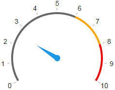
A simple circular gauge indicator component.
[Live demo](https://cdn.rawgit.com/dfcreative/gauge/d9bcf65f3bf0a4e6e52fb8add5bc6f5dc3bba1c5/test/index.html).
## Installation
`$ npm install component-gauge`
Or use standalone browser version [gauge.min.js](gauge.min.js), using global `Gague` class.
Don’t forget to include [index.css](gauge.min.js) and [arrow.svg](arrow.svg).
## Example
```js
var Gauge = require('component-gauge');
var q = require('query');
var gauge = new Gauge(q('.gauge'), options);
```
# API
### new Gauge(el, options)
Create a new Gauge component.
### Gauge.prototype.update()
Update gauge rings, marks & labels position.
### Gauge.prototype.value
Current gauge percent value, `0..100`.
# Options
| Param | Default | Description |
|---|---|---|
| `angle` | `[150, 390]` | Start and end angles defining gauge’s aperture |
| `values` | `{0: 'start', 100: 'end'}` | Dict of labels corresponding to percentage values |
| `colors` | `{0:'gray', 70:'orange', 90:'red'}` | Dict of colors corresponding to percentage values |
| `marks` | `[0,10,..100]` | List of marks, corresponding to percentage |
| `value` | `0` | Initial value |
# CSS
There are a bunch of styles you can tack to adjust gauge view. Look into [index.css](index.css).
For example, you can adjust arrow shape and visibility, inset/outset of values and marks.
[](https://nodei.co/npm/component-gauge/)