README.md
> Live demo http://iamisti.github.io/mdDataTable/
Angular material table. Complete implementation of google material design based on angular material components.
This component is optimized for speed, and it's faster then other similar implementations, since it generates a native html table, and browsers are optimized for tables.
> Angular2 and Angular2 Material version of this plugin is under development.
If you want to be notified for the first release, please star the project here: [`md-data-table2`](https://github.com/iamisti/mdDataTable2)
## Usage statistics
[](https://nodei.co/npm/md-data-table/)
[](https://nodei.co/npm/md-data-table/)
[](https://travis-ci.org/iamisti/mdDataTable)
[](https://codeclimate.com/github/iamisti/mdDataTable)
[](https://codeclimate.com/github/iamisti/mdDataTable/coverage)
[](https://gemnasium.com/iamisti/mdDataTable)
[](https://www.codacy.com/app/programtervezo/mdDataTable)
## Install
1. `bower install md-data-table` or `npm install md-data-table` or [download the source](https://github.com/iamisti/mdDataTable/archive/master.zip).
2. Make sure the `mdDataTable` (notice the camelCase typing) lib is loaded. It's served in three different files: `md-data-table-style.css`, `md-data-table.js`, `md-data-table-templates.js`
3. Add `mdDataTable` as a dependency of your app.
## Load it from CDN (with example of version 1.8.0)
https://cdnjs.cloudflare.com/ajax/libs/md-data-table/1.8.0/md-data-table-templates.min.js
https://cdnjs.cloudflare.com/ajax/libs/md-data-table/1.8.0/md-data-table.min.js
https://cdnjs.cloudflare.com/ajax/libs/md-data-table/1.8.0/md-data-table-style.css
## UI&UX driven by google data table
http://www.google.com/design/spec/components/data-tables.html
## Table of contents
[Overview](#overview)
[Table attributes](#table-attributes)
- selectable-rows
- virtual-repeat
- delete-row-callback
- selected-row-callback
- animate-sort-icon
- ripple-effect
- ! title-overflow-handler
- table-card
- paginated-rows
- alternate-headers
- mdt-row
- mdt-row-paginator
- mdt-row-paginator-error-message
- mdt-row-paginator-no-results-message
- mdt-trigger-request
- mdt-translations
- mdt-loading-indicator
[Column attributes (`mdt-column`)](#column-attributes)
- align-rule
- column-definition
- column-filter
- exclude-from-column-selector
- hide-column-by-default
[Row attributes (`mdt-row`)](#data-row-attributes)
- table-row-id
[Cell attributes (`mdt-cell`)](#data-cell-attributes)
- ! inline-menu
- editable-field
- html-content
[Custom cell content (`mdt-custom-cell`)](#custom-cell-content)
- column-key
## Overview
> In its simplest form, a data table contains a top row of column names, and rows for data.
## Table attributes
> Global attributes for the table
| Available | Params | Type | Details |
| ---------------- | ---------------------------------------------- | ------------- | ------------- |
|:white_check_mark:| selectable-rows | Boolean | optional, checkboxes accompany each row if need to select or manipulate data |
|:white_check_mark:| virtual-repeat | Boolean | optional, when set, virtual scrolling will be applied to the table. You must set a fixed height to the `.md-virtual-repeat-container` class in order to make it work properly. Since virtual scrolling is working with fixed height. |
|:white_check_mark:| delete-row-callback | Function | optional, callback function when deleting rows. The callback will be called with the array of the deleted row ids. Don't forget to specify `table-row-id` for `mdt-row`. If you do, it will return the deleted rows data. |
|:white_check_mark:| selected-row-callback | Function | optional, callback function when selecting rows. The callback will be called with the array of the selected row ids. Don't forget to specify `table-row-id` for `mdt-row`. If you do, it will return the selected rows data. |

| Available | Params | Type | Details |
| ---------------- | ---------------------------------------------- | ------------- | ------------- |
|:white_check_mark:| animate-sort-icon | Boolean | optional, if enabled, sort icon will be animated on change |
|:white_check_mark:| ripple-effect | Boolean | optional, if enabled, ripple effect will be applied on the column names when clicked |

| Available | Params | ChildParams | Type | Details |
| ---------------- | ---------------------------------- | ------------------------------- | ------------- | ------------- |
|:x: | title-overflow-handler | | String | optional, Sometimes, column names don’t fit in a container in between columns. There are two options to handle this |
|:x: | | _(default)_ truncateColumnNames | - | Shorten the column name and display it in full on hover |
|:x: | | useHorizontalScrollingOnTable | - | Display the full column name and enable horizontal scrolling in the table container |


| Available | Params | ChildParams | Type | Details |
| -----------------| ------------------------------------------ | ------------------------------- | ------------- | ------------- |
|:white_check_mark:| table-card | | Object | optional, tables can be embedded within a card, with table navigation and data manipulation tools available at the top and bottom. |
|:white_check_mark:| | title | String | The title of the table card |
|:x: | | actionIcons | Boolean | Card action icons (header and footer) |
|:white_check_mark:| | visible | Boolean | The visibility of the table card |
|:white_check_mark:| | columnSelector | Boolean | enables the column selection for the table (you can disable certain columns from the list selection, using `exclude-from-column-selector`, see the related docs) |

| Available | Params | ChildParams | Type | Details|
| -----------------| ------------------------------------------ | ------------------------------- | ------------- | ------ |
|:white_check_mark:| paginated-rows | | Object | optional, if set, then basic pagination will applied to the bottom of the table. |
|:white_check_mark:| | isEnabled | Boolean | Optional, if provided then basic pagination will applied to the bottom of the table |
|:white_check_mark:| | rowsPerPageValues | Array | Optional, if provided then it will apply the rows per page values from the given arguments. Example: [5,10,20] |

| Available | Params | ChildParams | Type | Details |
| ---------------- |----------------------------------- | ------------------------------- | ------------- | ------------- |
|:white_check_mark:| alternate-headers | | String | optional, some table cards may require headers with actions instead of titles. Two possible approaches to this are to display persistent actions, or a contextual header that activates when items are selected |
|:x: | | persistentActions | - | Shows persistent action buttons in header |
|:white_check_mark:| | contextual | - | Shows contextual content depending on what has been selected |

| Available | Params | ChildParams | Type | Details |
| ---------------- |----------------------------------- | ------------------------------- | ------------- | ------------- |
|:white_check_mark:| mdt-row | | Object | optional, makes possible to provide row data by passing the information through this attribute. Makes it possible to listen on data changes. |
|:white_check_mark:| | data | Array | required, The input data |
|:white_check_mark:| | table-row-id-key | String|Integer| optional (same as `table-row-id`), defines the id of the row. Useful if you specified the callback function (`delete-row-callback`) for deleting a row. |
|:white_check_mark:| | table-row-class-name | Function | optional, callback that defines the classname of a row. |
|:white_check_mark:| | column-keys | Array | required, property names of the passed data array. Makes it possible to configure which property should go in which column. |
|:white_check_mark:| mdt-translations | | Object | optional, makes it possible to provide a custom translated texts in the table. |
|:white_check_mark:| | rowsPerPage | String | When you need to select the amount of rows visible on the page, this label appears next to the dropdown |
|:white_check_mark:| | largeEditDialog.saveButtonLabel | String | When edit mode is on, in the modal you can click on a button which has the 'Save' label. |
|:white_check_mark:| | largeEditDialog.cancelButtonLabel| String | When edit mode is on, in the modal you can click on a button which has the : 'Cancel' label. |
|:white_check_mark:| mdt-loading-indicator | | Object | optional, if set then loading indicator can be customised. |
|:white_check_mark:| | color | String | Passing a css compatible format as a color will set the color for the loading indicator (e.g.: 'red' or '#008bd2', '#000') |
Html support is available for `mdt-row`, see more: [Custom cell content (`mdt-custom-cell`)](#custom-cell-content)
## Example usage for `mdt-row` attribute:
```html
<mdt-table
selectable-rows="true"
table-card="{title: Nutrition, actionIcons: true}"
mdt-row="{
'data': filteredItems,
'table-row-id-key': 'id',
'column-keys': ['name', 'calories', 'fat', 'carbs', 'protein', 'sodium', 'calcium', 'iron']
}">
<mdt-header-row>
<mdt-column>Dessert (100g serving)</mdt-column>
<mdt-column>Type</mdt-column>
<mdt-column>Calories</mdt-column>
<mdt-column sortable-rows-default>Fat (g)</mdt-column>
<mdt-column>Carbs (g)</mdt-column>
<mdt-column>Protein (g)</mdt-column>
</mdt-header-row>
<!-- notice we didn't provide mdt-row here -->
</mdt-table>
```
| Available | Params | Type | Details |
| ---------------- |------------------------------------ | ------------- | ------------- |
|:white_check_mark:| mdt-row-paginator | Function | optional, makes possible to provide a callback function which returns a promise, providing the data for the table. Has two parameters: `page` and `pageSize` (an optional parameter is `options` as a third parameter, which can have `columnFilter` property when `column-filter` is used or `columnSort` when you turn on column sorting feature |
|:white_check_mark:| mdt-row-paginator-error-message | String | optional, overrides default error mesasge when promise gets rejected by the paginator function. |
|:white_check_mark:| mdt-row-paginator-no-results-message| String | optional, overrides default 'no results' message when there are no results in the table. |
|:white_check_mark:| mdt-trigger-request | function(loadPageCallback) | optional, if `mdt-row-paginator` set, provides a callback function for manually triggering an ajax request. Can be useful when you want to populate the results in the table manually. (e.g.: having a search field in your page which then can trigger a new request in the table to show the results based on that filter. |
## Example usage for `mdt-row-paginator` attribute:
```html
<mdt-table
paginated-rows="{isEnabled: true, rowsPerPageValues: [5,10,20,100]}"
mdt-row-paginator="paginatorCallback(page, pageSize, options)"
mdt-row-paginator-error-message="Error happened during loading nutritions."
mdt-row="{
'table-row-id-key': 'fields.item_id',
'column-keys': [
'fields.item_name',
'fields.nf_calories',
'fields.nf_total_fat',
'fields.nf_total_carbohydrate',
'fields.nf_protein',
'fields.nf_sodium',
'fields.nf_calcium_dv',
'fields.nf_iron_dv'
],
}">
<mdt-header-row>
<mdt-column align-rule="left">Dessert (100g serving)</mdt-column>
<mdt-column align-rule="right">Calories</mdt-column>
<mdt-column align-rule="right">Fat (g)</mdt-column>
<mdt-column align-rule="right">Carbs (g)</mdt-column>
<mdt-column align-rule="right">Protein (g)</mdt-column>
<mdt-column align-rule="right">Sodium (mg)</mdt-column>
<mdt-column align-rule="right">Calcium (%)</mdt-column>
<mdt-column align-rule="right">Iron (%)</mdt-column>
</mdt-header-row>
</mdt-table>
```
## Column attributes
>`mdt-column` attributes
| Available | Params | ChildPArams | Type | Details |
| ---------------- | ---------------------------------------------- | --------------------|------------- | --------------- |
|:white_check_mark:| align-rule | |String | if provided, align the text to the needed direction for the entire column (note, that it aligns the data that belongs to the column) |
|:white_check_mark:| | _(default)_ left | | left-align content
|:white_check_mark:| | right | | right-align content
| Available | Params | Type | Details |
| ---------------- | ---------------------------------------------- | ------------- | --------------- |
|:white_check_mark:| column-definition | String | if provided, display a tooltip on hover. If sorting is enabled, display a light sort icon upon hover, which indicates that the column is sortable. |

| Available | Params | ChildPArams | Type | Details |
| -----------------| ---------------------------------------------- | -------------- | -------------- | --------------- |
|:x: | sortable-rows-default | - | | When column-sort is applied to the table, it marks the column as the default sorting column |
|:white_check_mark:| column-sort | | Boolean|Object | if provided, sort data and display a sorted state in the header. Clicking on a column which is already sorted will reverse the sort order and rotate the sort icon. |
|:white_check_mark:| column-sort | true|false | | in case of boolean, true value enables the feature, false disables it (default is disabled) |
|:white_check_mark:| column-sort | comparator | | in case of object, specifying a 'comparator' property which is a function for sorting the column data's. As every compare function, it gets two parameters and return with the compared result (-1,1,0) |
| Available | Params | ChildPArams | Type | Details |
| ---------------- | ---------------------------------------------- | -------------------------|------------- | --------------- |
|:white_check_mark:| column-filter | | Object | if provided, user can activate column filter feature on the selected column. |
|:white_check_mark:| | valuesProviderCallback | Function | required, function which provides the values into the column filter. It must return with a promise which resolves an array of strings/objects.|
|:white_check_mark:| | valuesTransformerCallback| Function | optional, function which transforms the provided objects into strings to be able to show it visually in the column filter.|
|:white_check_mark:| | placeholderText | Text | optional, placeholder which will show up as a default text (available only for `chips` and `dropdown` filter types |
|:white_check_mark:| | filterType | Text | optional, defines the type of the filter you want to use. Available options are: `chips`, `checkbox`, `dropdown`. If you don't specify it, the default will be `chips` |
|:white_check_mark:| exclude-from-column-selector | | Boolean | optional, excludes the column from the column selection feature |
|:white_check_mark:| hide-column-by-default | | Boolean | optional, make column unselected by default in the column selection panel |
> When filters are applied to the columns, a third parameter will be applied to the `mdt-row-paginator` callback function.
# Data-Row attributes
> `mdt-row` attributes
| Available | Params | Type | Details |
| ---------------- | ---------------------------------------------- | ------------- | --------------- |
|:white_check_mark:| table-row-id | String|Integer| defines the id of the row. Useful if you specified the callback function (`delete-row-callback`) for deleting a row. |
## Custom cell content
>`mdt-custom-cell` attributes
If you are using `mdt-row` attribute to load your data (which is only way of you are dealing with ajax contents), you can now have custom content for each cells you defined.
Important information:
> You can still access your scope variables/functions with accessing `clientScope` within the `mdt-custom-cell` directive. The value of the cell can be accessed by accessing `value` inside the directive.
> Accessing `rowId` also possible if you specified it with `table-row-id-key`.
| Available | Params | ChildParams | Type | Details |
| ---------------- | ---------------------------------------------- | ------------------ | ------------- | --------------- |
|:white_check_mark: | column-key | | String | required, specifies the column in the rows. |
There is only one scope variable that you can use in your template, and it's called `value`. Check the example.
## Example usage for `mdt-custom-cell`:
```html
<mdt-table>
<mdt-table mdt-row="{'data': filteredItems,
'table-row-id-key': 'id',
'column-keys': ['name', 'calories', 'fat', 'carbs', 'protein', 'sodium', 'calcium', 'iron']}">
<mdt-header-row>
<mdt-column align-rule="left">Dessert (100g serving)</mdt-column>
<mdt-column align-rule="right">Calories</mdt-column>
<mdt-column align-rule="right">Fat (g)</mdt-column>
<mdt-column align-rule="right">Carbs (g)</mdt-column>
<mdt-column align-rule="right">Protein (g)</mdt-column>
<mdt-column align-rule="right">Sodium (mg)</mdt-column>
<mdt-column align-rule="right">Calcium (%)</mdt-column>
<mdt-column align-rule="right">Iron (%)</mdt-column>
</mdt-header-row>
<!-- here you have your own, customised cell for every 'protein' column -->
<mdt-custom-cell column-key="protein">
<span ng-class="{'red': value > 5, 'green': value <= 5}">{{value}}</span>
<span ng-click="clientScope.myMethodToExecute()">click here</span>
<span>This is the row id for this column: {{rowId}}</span>
</mdt-custom-cell>
</mdt-table>
</mdt-table>
```
# Data-Cell attributes
>`mdt-cell` attributes
| Available | Params | ChildParams | Type | Details |
| ---------------- | ---------------------------------------------- | ------------------ | ------------- | --------------- |
|:x: | inline-menu | | Array | if provided, users can select from a predefined list of options. In this scenario, a menu component directly embedded in the table |


| Available | Params | ChildParams | Type | Details |
| ----------------------- | ---------------------------------------------- | ------------------ | ------------- | --------------- |
|:white_check_mark: | editable-field | | String | if provided, provides basic text editing. Include editable fields within a table and denote them using placeholder text(if empty). You can use a simple edit dialog with just a text field, or display a full dialog component on click. |
|:white_check_mark: | | smallEditDialog | - | A simple, one-field edit dialog on click |
|:white_check_mark: | | largeEditDialog | - | A complex, flexible edit edit dialog on click |
|:white_check_mark: | editable-field-title | | String | If set, then it sets the title of the dialog. (only for `largeEditDialog`) |
|:white_check_mark: | editable-field-max-length | | Number | if set, then it sets the maximum length of the field. |


| Available | Params | ChildParams | Type | Details |
| ---------------- | ---------------------------------------------- | ------------------ | ------------- | --------------- |
|:white_check_mark:| html-content | | Boolean | When the cell content is not a simple value (html content) |
## Example usage:
```html
<mdt-table
selectable-rows="true"
table-card="{title: Nutrition, actionIcons: true}">
<mdt-header-row>
<!-- defining column descriptions, align content to the left -->
<mdt-column
align-rule="left"
column-definition="The total amount of food energy in the given serving size.">
Dessert (100g serving)
</mdt-column>
<!-- in case of inline menu (INLINE-MENU FEATURE DOES NOT EXIST YET) -->
<mdt-column inline-menu="[ {iceCream: 'Ice Cream', pastry: 'Pastry', other: 'Other'} ]">Type</mdt-column>
<!-- inline text editing (EDITABLE-FIELDS FEATURE DOES NOT EXIST YET) -->
<mdt-column editable-field="textInput">
Calories
</mdt-column>
<!-- in case of sortable columns, we can set the defaultly sortable column -->
<mdt-column sortable-rows-default>
Fat (g)
</mdt-column>
<mdt-column>Carbs (g)</mdt-column>
<mdt-column>Protein (g)</mdt-column>
</mdt-header-row>
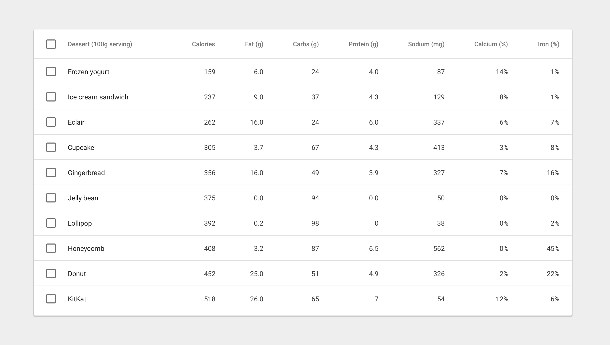
<mdt-row ng-repeat="nutrition in nutritionList">
<mdt-cell>Frozen Joghurt</mdt-cell>
<mdt-cell>159</mdt-cell>
<mdt-cell>6</mdt-cell>
<mdt-cell>24</mdt-cell>
<mdt-cell>4</mdt-cell>
<mdt-cell>87</mdt-cell>
</mdt-row>
</mdt-table>
```